Color Psychology in UX Design: The Definitive Guide (2026)
Stop guessing your website colors. Learn the psychological "triggers" that drive conversions, build trust, and skyrocket sales. Updated for 2026.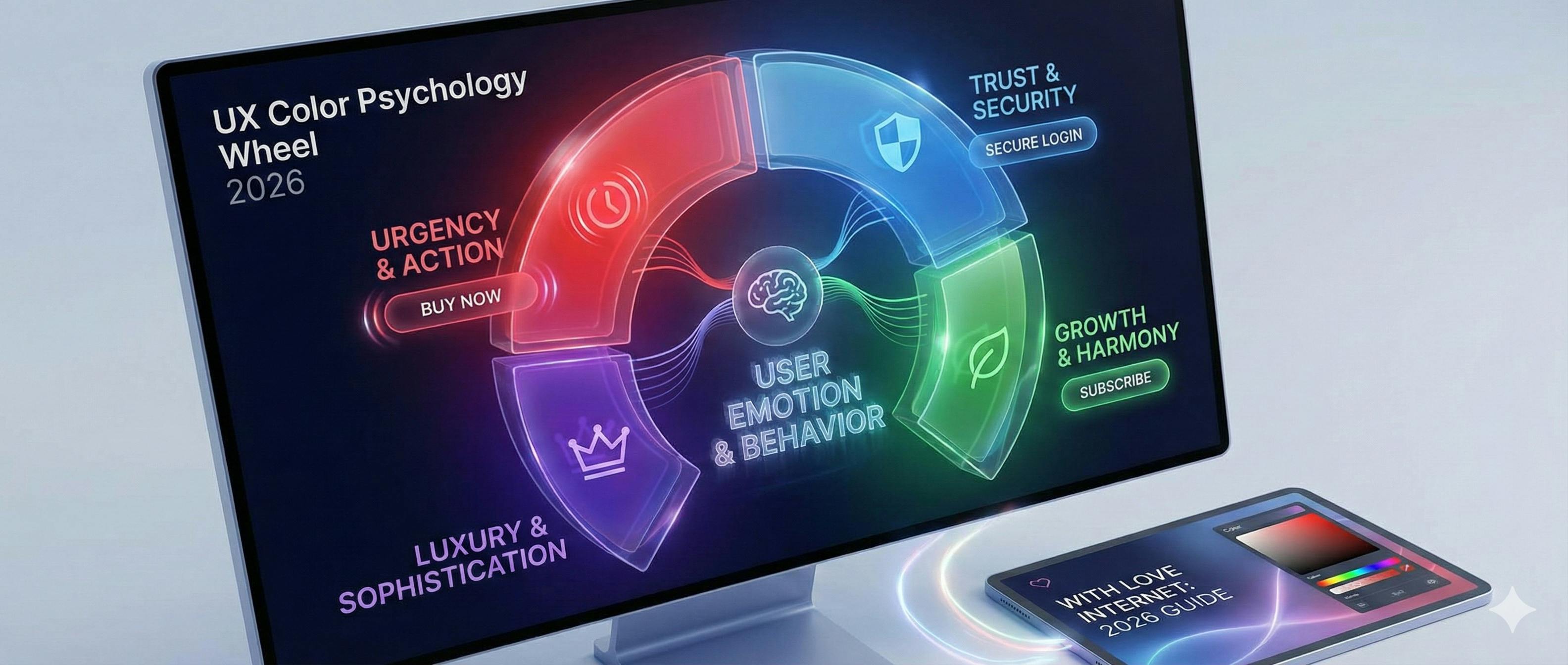
Let’s face it:
Most people think choosing colors for a website is about "what looks pretty."
They couldn’t be more wrong.
In fact, the colors you choose can be the difference between a user clicking "Buy Now" or hitting the "Back" button.
Want to know the best part?
You don't need to be a world-class artist to master this. You just need to understand the psychology behind the pixels.
In this updated guide, I’m going to show you exactly how to use color psychology to boost your conversions, build trust, and create a brand that people actually remember.
(Complete with updated 2026 data and accessibility standards.)
Let’s dive right in.

The 50-Millisecond Rule (Why This Matters)
Here is a stat that should keep every business owner up at night:
It takes users about 50 milliseconds (that’s 0.05 seconds) to form an opinion about your website.
0.05 seconds.
In that blink of an eye, the user isn’t reading your copy. They aren't looking at your features.
They are reacting to your visuals.
Specifically, your colors.
Research shows that up to 90% of snap judgments made about products can be based on color alone.
If your color palette feels "off," your conversion rate will suffer. Period.

Chapter 1: The "Big Three" Colors in Digital Marketing
Every color tells a story. But in the world of UX and digital marketing, three colors do the heavy lifting.
1. The Power of Red (Urgency & Action)
Red is the "stop sign" of the internet. It demands attention.
When to use it:
- Clearance sales.
- Warning messages.
- Call to Action (CTA) buttons.
The "HubSpot" Case Study: In a famous A/B test, red buttons outperformed green buttons by 21%. Why? Because red creates a sense of urgency that green simply can’t match.

2. The Trust of Blue (The Corporate Standard)
Why do Facebook, LinkedIn, Twitter (X), and PayPal all use blue?
Because blue is the psychological equivalent of a firm handshake. It represents:
- Trust
- Security
- Reliability
If you are in Fintech, Healthcare, or Legal, blue is your best friend.
3. The Growth of Green (Harmony & Success)
Green is the easiest color for the human eye to process. It signifies growth and "Go."
Pro Tip: In 2026, we’re seeing a massive shift toward "Verdant Greens"—deeper, more organic tones that signal sustainability and high-end wellness.

Chapter 2: The 60-30-10 Rule (The Pro Designer’s Secret)
How do you make a website look "expensive" without over-designing it?
At With Love Internet, we use the 60-30-10 Rule.
It works like this:
- 60% Primary Color: This is your background. Usually a neutral (White, Light Gray, or Off-Black).
- 30% Secondary Color: This supports the brand. Used for headers, icons, or sidebars.
- 10% Accent Color: This is your "Money Color."
Here is the secret: Use your 10% accent color ONLY for the things you want people to click. If everything is bright, nothing is important.
Chapter 3: Designing for "The 8%" (Accessibility)
Now, here is where most agencies drop the ball.
Accessibility.
Roughly 8% of men have some form of color blindness.
If your website relies only on color to convey meaning (like a red border for an error), 8% of your male audience might literally not see it.
The Fix:
- Don't just use color. Add icons (like an exclamation mark).
- Check your contrast. Use a 4.5:1 ratio for text.
- The Grayscale Test: Turn your monitor to black and white. If you can’t tell what’s clickable, your design is broken.

Chapter 4: The 2026 "Living Palette" Trends
The "flat" design of 2015 is dead. Here is what is working right now:
1. Digital Lavender
This is the "Calm-Tech" color of the year. It’s used to reduce "Digital Anxiety." Expect to see this in SaaS and Productivity apps throughout 2026.
2. Dark Mode Optimization
Dark mode isn’t just a toggle switch anymore. It’s a strategy. Research from MIT shows we process visuals in as little as 13ms, but in dark mode, light text on dark backgrounds can actually cause "Halation" (blurry text) for people with astigmatism.
The Solution? Never use pure #000000 black. Use a very dark navy or charcoal instead.
3. Glassmorphism & Gradients
We are moving back toward depth. Using subtle gradients makes buttons feel "tappable" and tactile.

Chapter 5: How to Choose Your Own Brand Palette (Step-by-Step)
Want to do this yourself? Here is our internal 3-step process:
Step 1: Identify Your Primary Emotion. What do you want people to feel?
- Excited? (Orange/Red)
- Calm? (Blue/Green)
- Luxurious? (Black/Gold)
Step 2: Use a Tool Like Adobe Color. Don't guess. Use the "Triad" or "Analogous" settings to find colors that mathematically work together.
Step 3: Test It in the Wild. Take your palette and put it on a landing page. Use a tool like Hotjar to see where people are looking. If they aren't looking at your CTA, change the color.

Conclusion
Color psychology isn't just "art." It’s data-driven communication.
By choosing the right palette, you’re not just making a pretty website—you’re building a conversion machine.
But here is the catch:
A great color palette can’t save a bad user experience. You need both.
What do you think? Which color represents your brand? And more importantly, is it actually doing its job?
If you aren't sure, we can help. At With Love Internet, we specialize in turning "pretty websites" into "high-performance business assets."
👉 Get a Free Design Audit from Our Team